
Written in collaboration with John Buchta
Inngest has evolved to meet the needs of developers, and with that evolution, our design has changed as well. Initially, both Inngest Cloud and Dev Server were built with a dark mode interface. However, when we redesigned Inngest Cloud in the beginning of 2023, we moved to a lighter theme. This decision helped users distinguish between Cloud and Dev Server more easily - no one wants to mistakenly perform actions in a production environment, thinking they're working in a local setup! But we realized that while clarity was improved, we removed the ability for developers to choose what they wanted.
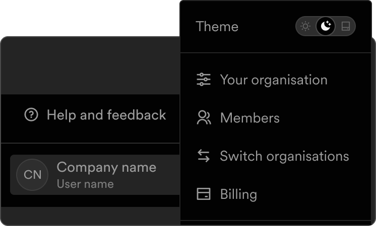
With this latest update, we're introducing a highly requested feature: dark mode! Now, users can toggle between light and dark modes.
Why theme switching matters
Color modes have become a hot topic in UI/UX design, with more users expecting the flexibility to choose between light and dark themes based on their preferences, environment, or device settings. Supporting both modes isn’t just a trend— it addressed accessibility needs, reduces eye strain during extended use, enhances readability across different lighting conditions, and improves overall user comfort. Our research showed that engineers frequently work in varied lighting environments, therefore the need for theme switching became apparent.
Beyond user-centric benefits, this update also aligns with our goal of improving consistency across our platforms. By unifying the design language between Inngest Cloud and Dev Server, we've measurably reduced the cognitive load and learning curve for users transitioning between environments. This consistency creates a more intuitive experience, allowing developers to focus on their workflow rather than adapting to interface differences.
Powered by a token system
To make this transition smoother, we created a token-based color system, implemented using a combination of Tailwind CSS and CSS variables.

Designing the tokens
In mid-2024, Inngest began to implement our own, bespoke color system after relying heavily on tailwind default colors. The reasoning behind this transition was multifaceted. With the addition of a new design team, we had the expertise and capacity to create a more cohesive visual product identity that truly represented Inngest. We wanted our UI and UX to match the high standard of developer experience (DX) that Inngest is known for. The default Tailwind colors served us well initially, but creating our own color system allowed us to express our product personality more effectively while ensuring accessibility and consistency across all our products.
When designing our color system, we adopted a structured token-based approach that followed modern design system principles. We began by establishing primitive tokens—our foundational color values that represented Inngest's core palette. From there, our design team methodically mapped these primitives to semantic tokens (representing UI concepts like 'success', 'warning', or 'info') and component-level tokens (specific to elements like buttons, cards, or navigation). This layered token architecture provided both flexibility and consistency across our interfaces. The process was significantly streamlined by Figma's introduction of Variables, which allowed us to maintain a single source of truth for each semantic or component token while associating both light and dark mode variants with it. This approach not only simplified design handoff but also reduced development complexity by enabling a cleaner implementation of theme switching without duplicating our design logic.
This means we no longer need to manage separate styles for light and dark mode manually—tokens handle the logic dynamically. The result? A scalable, maintainable design system that makes theme switching effortless while ensuring visual consistency.
Implementing the tokens
Our implementation began in June with the definition of design system colors and tokens in a CSS file using CSS variables. We then integrated these tokens into the Tailwind configuration, making our customized color palette easily accessible through Tailwind classes. Our code is open source, so feel free to explore and check it out!
backgroundColor: {canvasBase: 'rgb(var(--color-background-canvas-base) / <alpha-value>)',canvasSubtle: 'rgb(var(--color-background-canvas-subtle) / <alpha-value>)',canvasMuted: 'rgb(var(--color-background-canvas-muted) / <alpha-value>)',surfaceBase: 'rgb(var(--color-background-surface-base) / <alpha-value>)',surfaceSubtle: 'rgb(var(--color-background-surface-subtle) / <alpha-value>)',surfaceMuted: 'rgb(var(--color-background-surface-muted) / <alpha-value>)',disabled: 'rgb(var(--color-background-disabled) / <alpha-value>)',alwaysWhite: 'rgb(var(--color-foreground-alwaysWhite) / <alpha-value>)',contrast: 'rgb(var(--color-background-contrast) / <alpha-value>)',success: 'rgb(var(--color-background-success) / <alpha-value>)',}
One of the biggest challenges we faced was ensuring compatibility with third-party libraries, since they come with their own styling conventions and sometimes only accepted color strings rather than CSS variables or Tailwind classes.
Given our extensive codebase, updating Tailwind classes was a manual and time-consuming process. We took an incremental approach—starting with status colors and key design system components such as Buttons, Links, and Alerts. All new features introduced since then (e.g., Runs) were built using tokens from the outset, ensuring immediate compatibility with both themes.
Despite these efforts, a significant portion of legacy styles remained unchanged. To expedite the transition, we leveraged the holiday week in December—a quieter period with fewer code conflicts—to execute a large-scale color refactor.
Theme switch mechanism
Our theme switcher uses next-themes, as it has an easy implementation with a ThemeProvider component and a useTheme hook (handles cookies without messing Static Site Generation and Server Side Rendering).
Enjoy it!
We’re excited to bring dark mode to life and look forward to hearing your feedback. Try it out, make it yours, and let us know what you think!


